Have you ever tried to arrange boxes on a webpage and felt like CSS was fighting you? One box refuses to sit next to another. Everything looks fine on your screen but breaks on your friend’s laptop. You Google the problem, and two names keep showing up everywhere: Grid and Flexbox.
So which one do you actually need?
Here’s the honest answer: you don’t have to pick a “favorite.” They solve different problems, and most real websites use both. In this guide, I’ll explain the difference in plain English, show you simple code examples, and by the end, you’ll know exactly which one to reach for in any situation.
If you’re completely new to either one, I’d recommend skimming our CSS Grid Layout guide and our CSS Flexbox guide first. But even if you haven’t, this article will still make sense think of it as the “so which one wins?” follow-up.
What Problem Are We Even Solving?
Before Grid and Flexbox existed, arranging elements on a page was genuinely painful. Developers used tricks like float, display: inline-block, and even tables (yes, actual HTML tables) just to line things up side by side. These tricks worked, sort of, but they were fragile. Add one extra box, and the whole layout could fall apart.
Grid and Flexbox were both built to fix this. They give you proper tools to say “put this here, make that one bigger, leave equal space between these three” without hacks.
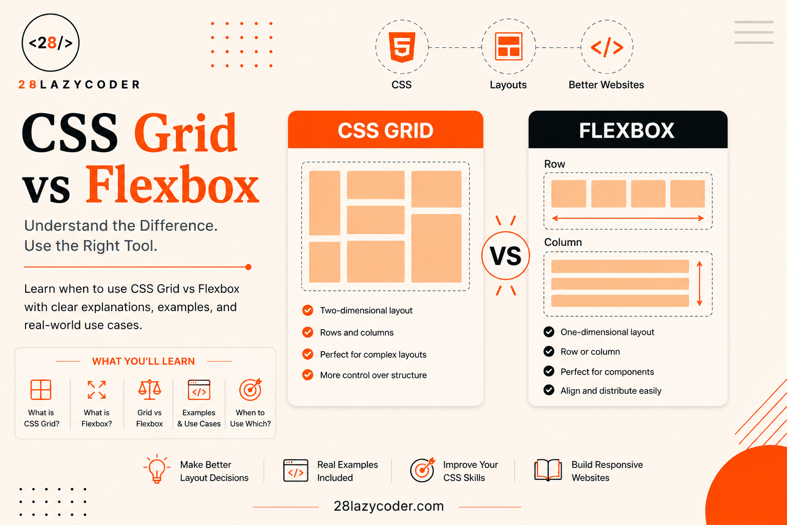
The key difference between them comes down to one simple idea: how many directions are you arranging things in?
One Direction vs Two Directions
Think of Flexbox like arranging books on a single shelf. You can line them up left to right, or stack them top to bottom, and you can control how much space each book takes up. But it’s still just one shelf one row or one column at a time.
Now think of Grid like arranging books in a full bookshelf with rows and columns at the same time. You can say “this book goes in row 2, column 3” and control the entire structure, both horizontally and vertically, together.
That’s really the whole difference in one sentence:
Flexbox arranges items in one direction. Grid arranges items in two directions (rows and columns) at once.
Everything else in this article builds on that one idea.
CSS Flexbox The One-Dimensional Tool
Flexbox (short for “Flexible Box Layout”) is designed for laying out items along a single line either a row or a column. According to flexbox deals with layout in one dimension at a time either as a row or as a column, which can be contrasted with the two-dimensional model of CSS Grid Layout.
It’s perfect for things like:
- A navigation bar with links spread across the top
- A row of buttons at the bottom of a form
- Centering a single item perfectly in the middle of its container
- A list of cards that need to sit side by side and wrap when the screen gets small
A Simple Flexbox Example
Imagine you want three buttons sitting in a row, evenly spaced, inside a container.
html
<div class="button-row">
  <button>Save</button>
  <button>Cancel</button>
  <button>Delete</button>
</div>
css
.button-row {
  display: flex;
  justify-content: space-between;
  align-items: center;
}
Here’s what’s happening, in plain words:
display: flexturns.button-rowinto a flex container. This just means “the children of this box will now follow flexbox rules.”justify-content: space-betweenspreads the buttons out evenly, with the first one touching the left edge and the last one touching the right edge.align-items: centerlines up the buttons in the middle, vertically.
Notice something: we never told the browser exact pixel positions. Flexbox figured out the spacing on its own, based on the available space. That’s the whole point it’s flexible.
When Flexbox Shines
Flexbox is your best friend whenever you’re arranging things along one line even if that line wraps onto multiple lines. A row of tags, a horizontal menu, a form with a label and input sitting side by side all classic Flexbox jobs.
CSS Grid The Two-Dimensional Tool
Grid, on the other hand, was built for full page layouts anything where you’re thinking in terms of rows and columns at the same time. CSS grid layout introduces a two-dimensional grid system to CSS, and grids can be used to lay out major page areas or small user interface elements.
Think of things like:
- A whole webpage layout: header, sidebar, main content, footer
- A photo gallery with equal-sized boxes in neat rows and columns
- A dashboard with cards of different sizes arranged in a grid
A Simple Grid Example
Let’s say you want to build a basic photo gallery with three columns.
html
<div class="gallery">
  <div class="photo">1</div>
  <div class="photo">2</div>
  <div class="photo">3</div>
  <div class="photo">4</div>
  <div class="photo">5</div>
  <div class="photo">6</div>
</div>
css
.gallery {
  display: grid;
  grid-template-columns: repeat(3, 1fr);
  gap: 16px;
}
Let’s break this down:
display: gridturns.galleryinto a grid container.grid-template-columns: repeat(3, 1fr)says “make 3 columns, and give each one an equal, flexible share of the space.” Thefrunit means “fraction” think of it like slicing a pizza into equal pieces.gap: 16pxadds space between the photos, both horizontally and vertically, without needing separate margin rules.
With just three lines of CSS, you’ve built a responsive-ish gallery grid. Try doing that with old-school floats it would take five times the code and twice the headache.
When Grid Shines
Grid is the right tool whenever your layout needs structure in both directions at once think of the overall skeleton of a page, not just a single row of buttons.
CSS Grid vs Flexbox Side-by-Side Comparison
| Feature | Flexbox | CSS Grid |
|---|---|---|
| Direction | One dimension (row OR column) | Two dimensions (rows AND columns together) |
| Best for | Navigation bars, button groups, centering items | Page layouts, photo galleries, dashboards |
| Item sizing | Items size based on content, unless told otherwise | You define the structure first, items fit into it |
| Wrapping content | Very natural with flex-wrap | Possible, but Grid is more about fixed structure |
| Mental model | “Arrange these items in a line” | “Design the whole layout, then place items in it” |
| Browser support | Excellent, supported everywhere modern | Excellent, supported everywhere modern |
Can You Use Grid and Flexbox Together?
Yes and honestly, most real-world websites do exactly this. It’s not an either/or decision.
A very common pattern looks like this:
- Use Grid to lay out the big page structure: header, sidebar, main content, footer.
- Use Flexbox inside smaller sections, like a row of icons in the header or buttons inside a card.
Example: Grid for the Page, Flexbox Inside a Card
css
/* Grid for the overall page layout */
.page {
  display: grid;
  grid-template-columns: 250px 1fr;
  grid-template-rows: auto 1fr auto;
}

/* Flexbox for a row of items inside one card */
.card-footer {
  display: flex;
  justify-content: space-between;
  align-items: center;
}
The .page container handles the big picture sidebar on the left, content on the right. The .card-footer inside one small card handles a simple row that’s Flexbox’s job. Neither one is “better.” They’re just built for different-sized problems.
A Simple Way to Decide Which One to Use
If you’re ever stuck deciding, ask yourself this one question:
“Am I arranging things in one line, or am I building a full grid structure?”
- One line (even if it wraps) → Flexbox
- Rows and columns together → Grid
If you’re still unsure, here’s a beginner-friendly rule of thumb: start with Flexbox for small components, and reach for Grid when you’re planning the overall page skeleton. As you build more projects, this decision will start to feel automatic.
Conclusion
CSS Grid and Flexbox aren’t rivals they’re teammates. Flexbox is brilliant at lining things up in one direction, like a row of buttons or a navbar. Grid is brilliant at building full two-dimensional layouts, like a page skeleton or a photo gallery. Once you stop thinking “which one is better” and start thinking “which one fits this specific job,” CSS layouts stop being scary and actually become fun to build.
The best way to really understand the difference is to build something small with each one. Try recreating a simple webpage header with Flexbox, then try building a 3-column gallery with Grid. You’ll feel the difference in your hands, not just in theory.
FAQs
Q1. Is CSS Grid replacing Flexbox? No. They were built for different jobs and both are still actively used and maintained. Grid didn’t replace Flexbox it just gave developers a second tool for two-dimensional layouts.
Q2. Which one should a beginner learn first? Most beginners find Flexbox a little easier to start with, since you’re only thinking about one direction at a time. Once you’re comfortable with that, Grid will make more sense because you’ll already understand ideas like justify-content and align-items.
Q3. Can I use Grid and Flexbox on the same page? Yes, absolutely and you should! It’s completely normal to use Grid for your overall page layout and Flexbox for smaller components inside that layout, like a card or a navigation bar.
Q4. Does Flexbox work for responsive design? Yes. Combined with flex-wrap, Flexbox items can wrap onto new lines automatically as the screen gets smaller, which makes it great for responsive rows of items like cards or tags.
Q5. Is CSS Grid supported in all browsers? Yes, both Grid and Flexbox have excellent support in all modern browsers, so you can use them confidently in real projects today.
Continue Learning
- CSS Grid Layout: A Complete Beginner’s Guide with Examples
- CSS Flexbox: A Complete Beginner’s Guide with Examples
- HTML Forms Explained: A Complete Beginner’s Guide with Examples
- JavaScript DOM Manipulation Explained
- Latest HTML Updates in 2026: What’s New for Modern Web Developers?
Explore more guides on the 28LazyCoder blog or visit the homepage.