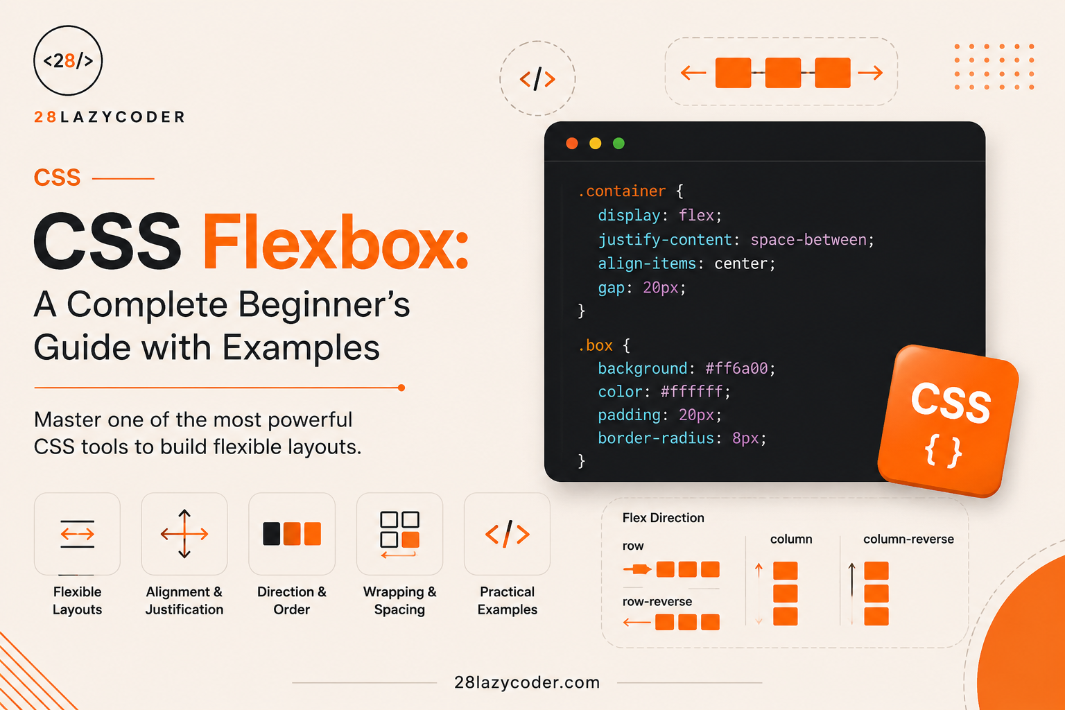
If you have ever opened your CSS file and tried to line up three boxes side by side, only to watch them jump around, overlap, or refuse to sit in the middle of the page — don’t worry. Every single developer has been there. I remember spending almost two hours trying to center one <div> on a page before I finally understood what was going wrong.
The good news? There is one CSS tool that fixes almost all of these layout headaches in a few lines of code. It’s called Flexbox.
By the end of this article, you will not just know what Flexbox is — you will actually understand why it works the way it does, and you will be able to build real layouts with confidence.
Let’s start from zero.
What Is CSS Flexbox? (Explained Like You’re 5)
Think about a school assembly line. When the teacher tells students to “stand in one row, evenly spaced, all facing the same way” — every student automatically knows where to stand. Nobody needs a ruler. The row adjusts itself whether there are 10 students or 30 students.
That’s exactly what Flexbox does for boxes on a webpage.
Flexbox (Flexible Box Layout) is a CSS layout system that helps you arrange elements in a row or a column, and automatically handles spacing, alignment, and sizing — even when the screen size changes.
Before Flexbox existed, developers used tricks like float, display: inline-block, or even HTML tables just to place three boxes side by side. These tricks were unreliable. Boxes would break on smaller screens, spacing would go wrong, and centering something vertically felt like solving a puzzle.
Flexbox was built to solve exactly this problem.
Did You Know? Flexbox became a stable part of the CSS specification around 2015–2017, and today it is supported by every modern browser. You can safely use it in any project.
Why Do We Need Flexbox? What Problem Does It Solve?
Let’s answer this directly, the way we should after every new concept.
Why do we need this? Because websites are not built with fixed-size boxes anymore. A visitor might open your site on a mobile phone, a tablet, or a large monitor. Your layout needs to adjust automatically — and doing that with old CSS methods was painful.
What problem does it solve? Flexbox solves three big layout problems in one shot:
- Arranging items in a row or column easily.
- Aligning items — center, left, right, top, bottom — without guesswork.
- Distributing empty space between items automatically.
What happens if we don’t use it? You would have to manually calculate widths, use extra wrapper <div>s, and write messy CSS with float and clear — and it would still break on different screen sizes.
Think of Flexbox like a smart TV remote. Without it, you’d be getting up from the couch and manually adjusting the TV’s antenna every time (old CSS methods). With the remote (Flexbox), one press does everything (auto align, auto space, auto adjust).
Flex Container vs Flex Items — The Foundation of Flexbox
This is the single most important idea in this entire article. Once this clicks, everything else becomes easy.
Imagine a school classroom:
- The classroom is like a container. It decides how students (items) are arranged — in rows, in a single line, spaced out, etc.
- The students are like flex items. They sit inside the classroom and follow the arrangement rules the classroom (teacher) sets.
In CSS, it works the same way:
- The parent element becomes the flex container — you turn on Flexbox here.
- The child elements inside it automatically become flex items.
Syntax: Creating a Flex Container
css
.container {
  display: flex;
}
Explaining every line:
.container— this is the CSS selector targeting the parent element (like the classroom).display: flex;— this single line tells the browser: “Treat this element as a flex container, and arrange all its direct children using Flexbox rules.”
That’s it. One line of CSS, and suddenly all the child elements inside .container line up in a row automatically.
Example: HTML + CSS
html
<div class="container">
  <div class="box">1</div>
  <div class="box">2</div>
  <div class="box">3</div>
</div>
css
.container {
  display: flex;
  background-color: #F7F3E9;
  padding: 20px;
}

.box {
  background-color: #FF7A18;
  color: white;
  padding: 20px;
  margin: 5px;
}
Output: The three boxes (1, 2, 3), which would normally stack on top of each other like a to-do list, now sit neatly side by side in a single row.
Why does this output appear? Because display: flex changes the default behavior of the container. Normally, <div> elements stack vertically (like items in a shopping list). But once the container becomes a flex container, its children line up horizontally by default, in a row, side by side — just like students standing in a line.
Real-world use case: This exact pattern is used in navigation bars. Think of any website’s top menu — Home, About, Services, Contact — all sitting neatly in a single row. That’s Flexbox at work.
[Diagram: Flex container and flex items arranged in a row]
The Two Axes of Flexbox: Main Axis and Cross Axis
This concept confuses most beginners — but once you understand it with an example, you’ll never forget it.
Imagine a traffic signal road. Cars can move in two directions:
- Along the road (forward direction) — this is like the Main Axis.
- Across the road (sideways, from one side to the other) — this is like the Cross Axis.
In Flexbox:
- By default, the main axis is horizontal (left to right), because
flex-directiondefaults torow. - The cross axis is always perpendicular (90 degrees) to the main axis — so by default, it’s vertical.
Why does this matter? Because two of the most important Flexbox properties — justify-content and align-items — work based on these axes:
| Property | Works Along | Purpose |
|---|---|---|
justify-content | Main Axis | Aligns items horizontally (in default row direction) |
align-items | Cross Axis | Aligns items vertically (in default row direction) |
Tip: If
justify-contentisn’t doing what you expect, check yourflex-directionfirst. The “main axis” changes when you switch fromrowtocolumn.
flex-direction: Choosing Row or Column
Let’s go back to real life. Think about YouTube’s homepage. Video thumbnails are arranged in a row across the screen. Now think about WhatsApp’s chat list — messages are stacked one below another, in a column.
Both layouts are possible with Flexbox, just by changing one property: flex-direction.
Syntax
css
.container {
  display: flex;
  flex-direction: row; /* default */
}
css
.container {
  display: flex;
  flex-direction: column;
}
Explaining the values:
| Value | What It Does |
|---|---|
row | Items arranged left to right (default) |
row-reverse | Items arranged right to left |
column | Items arranged top to bottom |
column-reverse | Items arranged bottom to top |
Output for column: Instead of boxes 1, 2, 3 sitting side by side, they now stack on top of each other — like a vertical list.
Real-world use case: Mobile app menus, WhatsApp chat lists, and sidebar navigation menus almost always use flex-direction: column.
justify-content: Controlling Horizontal Spacing (Main Axis)
Imagine a movie theatre row of seats. Sometimes the seats are:
- All grouped together on the left.
- Spread evenly across the row with gaps.
- Grouped in the center.
justify-content controls exactly this kind of spacing — but for your flex items, along the main axis.
Syntax and Values
css
.container {
  display: flex;
  justify-content: center;
}| Value | What Happens |
|---|---|
flex-start | Items stick to the start (default) |
flex-end | Items stick to the end |
center | Items are centered |
space-between | Equal space between items, none on the edges |
space-around | Equal space around each item |
space-evenly | Completely equal space everywhere, including edges |
Explaining space-between vs space-around:
Think about three friends sharing a WhatsApp group photo layout:
space-between— the first friend touches the left wall, the last friend touches the right wall, and equal gaps are placed only between them.space-around— each friend gets equal space on both sides, so the edge gaps are smaller than the gaps between friends (each friend “hugs” their own space).space-evenly— every gap, including the two at the edges, is exactly equal.
Common Mistake: Beginners often confuse
space-betweenandspace-around. Remember: “between” means space is only between items, not on the outer edges.
align-items: Controlling Vertical Alignment (Cross Axis)
Now think about an ATM machine screen. The buttons on the side are aligned vertically — some ATMs align them to the top, some to the center of the screen height.
align-items controls how flex items align along the cross axis (vertical, by default).
Syntax and Values
css
.container {
  display: flex;
  align-items: center;
}| Value | What Happens |
|---|---|
stretch | Items stretch to fill the container height (default) |
flex-start | Items align to the top |
flex-end | Items align to the bottom |
center | Items are vertically centered |
baseline | Items align based on their text baseline |
The Famous Centering Trick
This is probably the most searched CSS question ever: “How do I center a div?”
css
.container {
  display: flex;
  justify-content: center;
  align-items: center;
  height: 100vh;
}
Explaining every line:
display: flex;— turns the parent into a flex container.justify-content: center;— centers the item horizontally (main axis).align-items: center;— centers the item vertically (cross axis).height: 100vh;— makes the container take the full height of the screen, so vertical centering is actually visible.
Output: Any element inside .container — a login box, a card, a button — sits perfectly in the middle of the screen, both horizontally and vertically.
Real-world use case: This exact pattern is used on login pages, “404 Page Not Found” pages, and loading screens across almost every modern website.
Best Practice: Whenever you need to center something perfectly on a page, reach for
justify-content: center+align-items: centerbefore trying anything else. It works in 90% of real cases.
flex-wrap: What Happens When Items Don’t Fit?
Picture a shopping mall parking lot. If ten cars try to fit into a five-car row, either the cars overflow the lane, or the parking system creates a new row for the extra cars.
By default, Flexbox tries to squeeze all items into a single line — even if they shrink uncomfortably. flex-wrap lets items move to a new line instead.
Syntax
css
.container {
  display: flex;
  flex-wrap: wrap;
}| Value | Meaning |
|---|---|
nowrap | All items stay in one line (default), shrinking if needed |
wrap | Items move to a new line when there isn’t enough space |
wrap-reverse | Same as wrap, but new lines are added above instead of below |
Real-world use case: Online shopping websites (like product cards on an e-commerce page) use flex-wrap: wrap so that product cards automatically rearrange into new rows on smaller screens like mobile phones.
Warning: If you forget
flex-wrap, your layout may look fine on a laptop but completely break — items squished or overflowing — on a mobile phone. Always test responsiveness.
flex-grow, flex-shrink, and flex-basis: Controlling Item Size
Here’s where a lot of beginners get scared by the terminology — but the real-life example makes it simple.
Think about splitting a food order bill among friends:
- flex-basis is like each person’s “starting share” of the bill before any adjustments.
- flex-grow is like saying, “If there’s extra money left over (leftover space), this friend will happily take more of it.”
- flex-shrink is like saying, “If the bill is more than expected (not enough space), this friend is willing to shrink their share.”
flex-grow
css
.box1 { flex-grow: 1; }
.box2 { flex-grow: 2; }
Explanation: If there is extra empty space in the container, .box2 will grow to take up twice as much of that extra space compared to .box1, because its flex-grow value is twice as large. If flex-grow is 0 (the default), the item won’t grow at all, even if there’s space.
flex-shrink
css
.box1 { flex-shrink: 1; }
.box2 { flex-shrink: 0; }
Explanation: If the container is too small to fit all items, .box1 is allowed to shrink, but .box2 (with flex-shrink: 0) refuses to shrink and keeps its original size — even if that causes overflow.
flex-basis
css
.box {
  flex-basis: 200px;
}
Explanation: This sets the “starting size” of the flex item before any growing or shrinking happens — similar to width, but it specifically works within the flex layout system.
The Shortcut: flex
In real projects, developers usually combine all three using the shorthand flex property:
css
.box {
  flex: 1 1 200px;
}
This means: flex-grow: 1, flex-shrink: 1, flex-basis: 200px — grow if there’s space, shrink if needed, but start at 200px.
Interview Tip: A common interview question is: “What is the difference between
flex-basisandwidth?” The answer:flex-basisis flex-aware and takes priority overwidthinside a flex container, whilewidthis a general-purpose CSS property used everywhere.
align-self: Overriding Alignment for One Item
Sometimes, in a WhatsApp group photo, everyone stands at the same height — except one taller friend at the back who is positioned slightly differently on purpose. That’s exactly what align-self allows.
css
.special-box {
  align-self: flex-end;
}
Explanation: While align-items sets alignment for all items in the container, align-self lets you override that alignment for just one specific item — without touching the others.
Real-world use case: A “Featured” product card in an e-commerce grid that needs to align differently from the rest.
gap: Adding Space Between Items (Without Margin Hacks)
Before gap existed, developers used margin on flex items to create spacing — but this often caused extra, unwanted space at the very edges of the container.
css
.container {
  display: flex;
  gap: 20px;
}
Explanation: gap adds consistent spacing between flex items only — not on the outer edges of the container. This is cleaner and far easier to manage than manually adding margins to every item.
Best Practice: Always prefer
gapover margin-based spacing tricks when working with modern Flexbox layouts. It is supported in all current browsers.
Real-World Example: Building a Simple Navigation Bar
Let’s put everything together into something practical — a navigation bar, just like the one at the top of almost every website you visit, including this one.
html
<nav class="navbar">
  <div class="logo">28LazyCoder</div>
  <ul class="nav-links">
    <li>Home</li>
    <li>Blog</li>
    <li>About</li>
    <li>Contact</li>
  </ul>
</nav>
css
.navbar {
  display: flex;
  justify-content: space-between;
  align-items: center;
  background-color: #202020;
  padding: 15px 30px;
}

.logo {
  color: #FF7A18;
  font-weight: bold;
}

.nav-links {
  display: flex;
  gap: 25px;
  list-style: none;
  color: white;
}
Explaining every line:
.navbarbecomes a flex container, so the logo and the menu list sit in a row automatically.justify-content: space-betweenpushes the logo to the far left and the menu to the far right, with empty space between them.align-items: centervertically centers both the logo and the menu, even if they have slightly different heights..nav-linksis also a flex container (yes, an item can be a container for its own children), usinggap: 25pxto space out each menu link evenly.
Output: A clean, professional navigation bar with the logo on the left and the menu items neatly spaced on the right — exactly like what you’d see on most real websites.
Why does this matter? Because this single pattern — container + justify-content: space-between + align-items: center — is one of the most reused layout patterns in real-world frontend development.
[Screenshot: Example navbar layout using Flexbox]
Flexbox vs CSS Grid: What’s the Difference?
Beginners often ask: “If Flexbox can do all this, why does CSS Grid exist?” Great question — and it deserves a clear answer.
| Feature | Flexbox | CSS Grid |
|---|---|---|
| Layout Direction | One dimension (row OR column) | Two dimensions (rows AND columns together) |
| Best For | Navigation bars, buttons, aligning small groups of items | Full page layouts, complex grids like photo galleries |
| Learning Curve | Easier for beginners | Slightly more advanced |
| Common Use Case | Aligning items within a section | Structuring the entire page layout |
Simple rule of thumb: If you’re arranging items in a single row or column, use Flexbox. If you’re designing a full layout with both rows and columns working together (like a dashboard), CSS Grid is usually the better tool. In many real projects, developers use both together.
Common Mistakes Beginners Make with Flexbox
Common Mistake #1: Forgetting that
display: flexmust be applied to the parent, not the child. Beginners often mistakenly adddisplay: flexto the item they want to move, instead of its container.
Common Mistake #2: Confusing
justify-contentandalign-items. Remember:justify-content= main axis (horizontal by default),align-items= cross axis (vertical by default).
Common Mistake #3: Not adding
flex-wrap: wrap, causing items to awkwardly shrink or overflow on smaller screens.
Common Mistake #4: Using
marginfor spacing between items instead of the simpler and cleanergapproperty.
Best Practices for Using Flexbox in Real Projects
- Always set
display: flexon the parent container, never on individual items. - Use
gapinstead of margins for spacing between items. - Combine
flex-wrap: wrapwith responsive design so layouts adjust smoothly on mobile devices. - Use the
flexshorthand (flex-grow,flex-shrink,flex-basis) instead of setting each property separately, for cleaner code. - Test your layout on multiple screen sizes — what looks perfect on a laptop can break on a phone.
- Use Flexbox for smaller layout sections (navbars, cards, buttons) and CSS Grid for full-page structure.
Interview Questions on Flexbox (For Beginners)
- What is the difference between a flex container and a flex item?
- What is the default value of
flex-direction? - What is the difference between
justify-contentandalign-items? - How do you vertically and horizontally center a
<div>using Flexbox? - What is the difference between
space-betweenandspace-around? - What does the
flex-growproperty do? - When would you choose CSS Grid over Flexbox?
Interview Tip: Interviewers often ask you to center a div live on a whiteboard or code editor. Practice the
justify-content: center+align-items: centerpattern until it becomes muscle memory.
Frequently Asked Questions (FAQs)
Q1. Is Flexbox still relevant in 2026, or has CSS Grid replaced it? Flexbox is still very much relevant. It is not replaced by CSS Grid — both exist for different purposes. Flexbox is ideal for one-dimensional layouts (a single row or column), while Grid handles two-dimensional layouts. Most real projects use both together.
Q2. Do I need to learn CSS Grid before Flexbox? No. Flexbox is generally considered easier to learn first, and it’s used far more frequently for smaller components like navbars, buttons, and cards. Learn Flexbox first, then move on to Grid.
Q3. Does Flexbox work on all browsers? Yes. Flexbox is supported by all modern browsers, including Chrome, Firefox, Safari, and Edge. It has been a stable part of the CSS specification for many years now.
Q4. Can I use Flexbox for the entire page layout? You can, especially for simpler websites. But for complex layouts involving both rows and columns interacting together (like a dashboard), CSS Grid is usually a better fit.
Q5. What is the difference between flex-basis and width? flex-basis defines the starting size of an item specifically within a flex container and takes priority over width when both are set on a flex item. width is a general CSS property used in all types of layouts.
Conclusion
Flexbox might feel a little overwhelming with all its property names at first — justify-content, align-items, flex-grow, flex-wrap — but once you understand the core idea of a flex container and its flex items, everything else is just fine-tuning.
Start small. Practice centering a single box. Then build a simple navbar. Then try a row of cards that wraps on mobile. Each small project will make these properties feel natural, until one day you’ll write display: flex without even thinking about it — the same way you don’t think twice before opening WhatsApp to send a message.
You don’t need to memorize everything today. Bookmark this guide, come back to it, and practice a little every day. That’s exactly how real developers learn.
Additional SEO & Technical Assets
Internal Linking Table
| Anchor Text | Target URL |
|---|---|
| JavaScript Arrays | https://28lazycoder.com/javascript-arrays/ |
| JavaScript Functions Explained for Beginners | https://28lazycoder.com/javascript-functions/ |
| JavaScript Conditional Statements Guide | https://28lazycoder.com/javascript-conditional-statements/ |
| Custom WordPress Theme Development Guide | https://28lazycoder.com/custom-wordpress-theme-development/ |
External Linking Table (Trusted Sources)
| Title | Target URL | Context |
|---|---|---|
| MDN Flexbox documentation | https://developer.mozilla.org/en-US/docs/Web/CSS/CSS_flexible_box_layout | Reference for further reading |
| W3C Flexbox specification | https://www.w3.org/TR/css-flexbox-1/ | Technical spec reference |
| web.dev Flexbox guide | https://web.dev/learn/css/flexbox/ | Deeper learning resource |