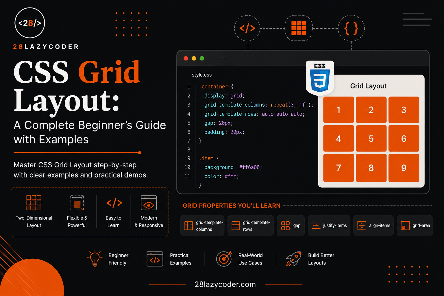
Open Instagram’s explore page. Dozens of photos, neatly arranged in perfect rows and columns, all the same size, all lined up without a single gap out of place.
Now open Amazon’s homepage. Product cards arranged in a clean grid — same width, same spacing, automatically adjusting when you resize the browser.
Neither of these was built with guesswork. Both use grid-based layouts — and in CSS, the tool built specifically for this job is called CSS Grid.
If you’ve ever tried to line up cards or images using floats and margins, and ended up fighting with spacing that never quite matched — this guide is going to feel like a huge relief.
Let’s build this up from zero, the way a senior developer would explain it over a cup of chai.
What Is CSS Grid?
CSS Grid is a layout system that lets you arrange elements on a web page into rows and columns, just like a table — but far more flexible and powerful.
Think about a calendar app. Every date sits in its own neat box, aligned perfectly into 7 columns (days of the week) and multiple rows (weeks). That structure — rows and columns forming a grid — is exactly what CSS Grid was built to create.
css
.container {
  display: grid;
}
That one line is all it takes to turn any element into a grid container. Everything else — how many columns, how much space between items, how big each row is — you control from there.
Note: If you’re comfortable with the box model and basic CSS selectors already, CSS Grid will feel like a natural next step. If not, it’s worth getting comfortable with basic CSS positioning first.
Why Do We Need CSS Grid?
Before Grid existed, developers built layouts using floats, inline-block, or tables — all of which were originally designed for something else and repurposed for layout. This led to layouts that were fragile, hard to make responsive, and full of small alignment bugs.
CSS Grid was built specifically to solve two-dimensional layout — controlling rows and columns at the same time, in one place.
Real-world example: Think about a food delivery app’s restaurant listing page. Restaurant cards need to line up in neat rows and columns, resize on different screens, and keep consistent spacing. That’s a textbook CSS Grid use case.
Grid Terminology You Must Know
Before writing any code, let’s get familiar with a few terms — this makes everything ahead much easier to follow.
| Term | Meaning |
|---|---|
| Grid Container | The parent element with display: grid applied |
| Grid Item | Any direct child of the grid container |
| Grid Line | The dividing lines that make up the structure of the grid (both horizontal and vertical) |
| Grid Track | A single row or column in the grid |
| Grid Cell | A single unit — the intersection of one row and one column |
| Grid Gap | The spacing between rows and columns |
| Grid Area | One or more cells combined together, forming a named region |
Real-world example: Think of a chessboard. The whole board is the grid container. Each square is a grid cell. The lines separating the squares are grid lines. A group of squares combined (like the four center squares) would be a grid area.
How to Create Your First Grid
Let’s build an actual grid, step by step.
html
<div class="container">
  <div class="box">1</div>
  <div class="box">2</div>
  <div class="box">3</div>
  <div class="box">4</div>
  <div class="box">5</div>
  <div class="box">6</div>
</div>
css
.container {
  display: grid;
  grid-template-columns: 200px 200px 200px;
}

.box {
  background-color: #FF7A1A;
  color: white;
  padding: 20px;
  text-align: center;
}
Line-by-line explanation:
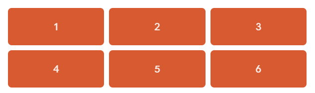
display: gridturns.containerinto a grid, and all its direct children (.boxelements) automatically become grid items.grid-template-columns: 200px 200px 200pxcreates three columns, each exactly 200px wide.- Since there are 6 boxes and only 3 columns, Grid automatically wraps the extra boxes into a second row — you didn’t have to write any extra code for that.
Output: Six orange boxes arranged neatly into 2 rows and 3 columns, all equally sized.
Real-world use case: This exact pattern — a fixed number of columns, auto-wrapping rows — is how product grids, photo galleries, and dashboard widgets are commonly built.
Defining Rows and Columns
You’re not limited to fixed pixel widths. CSS Grid gives you a special unit called fr (fraction unit) that divides available space proportionally.
css
.container {
  display: grid;
  grid-template-columns: 1fr 2fr 1fr;
  grid-template-rows: 100px 200px;
}
What’s happening here?
1fr 2fr 1frcreates three columns. The middle column gets twice the space of the other two, because2fris twice1fr. The total width is automatically divided proportionally, no matter the screen size.grid-template-rows: 100px 200pxcreates two rows — the first 100px tall, the second 200px tall.
Real-world example: Think of a YouTube video page layout — the main video player takes up more width (like 2fr), while the sidebar with recommended videos takes less (like 1fr). As the browser resizes, both sections shrink or grow proportionally, keeping the same balance.
Tip: You can mix units freely —
grid-template-columns: 200px 1fr 1frgives you one fixed-width column and two flexible ones that share the remaining space equally.
Gaps Between Grid Items
Instead of using margins (which can cause uneven spacing at the edges), Grid gives you a dedicated property for spacing.
css
.container {
  display: grid;
  grid-template-columns: 1fr 1fr 1fr;
  gap: 20px;
}
What’s happening here? gap: 20px adds 20px of space between every row and column — but not around the outer edge of the grid. This keeps spacing perfectly even, without the “double margin” problem you’d get using margins on individual items.
You can also control row and column gaps separately:
css
.container {
  row-gap: 20px;
  column-gap: 10px;
}
Real-world use case: This is exactly how Instagram’s photo grid keeps consistent spacing between every image, no matter how many photos are shown.
Placing Items on the Grid
By default, items fill the grid in order — left to right, top to bottom. But you can manually control exactly where an item sits.
css
.featured {
  grid-column: 1 / 3;
  grid-row: 1 / 2;
}
What’s happening here?
grid-column: 1 / 3tells the item to start at grid line 1 and end at grid line 3 — meaning it spans across two columns.grid-row: 1 / 2keeps it within the first row.
Output: This particular item becomes wider than the others, stretching across two columns, while everything else keeps its normal single-cell size.
Real-world example: Think about a news website homepage — the “featured” or “breaking news” story is usually bigger, spanning across multiple columns, while smaller stories sit in single cells around it. That’s exactly this technique in action.
Warning: Grid lines start counting from 1, not 0. This trips up a lot of beginners coming from array indexing in JavaScript or PHP, where counting starts from 0.
Grid Template Areas
This is one of CSS Grid’s most beginner-friendly features — it lets you literally draw your layout using words.
css
.container {
  display: grid;
  grid-template-columns: 200px 1fr;
  grid-template-rows: 80px 1fr 60px;
  grid-template-areas:
    "sidebar header"
    "sidebar content"
    "sidebar footer";
}

.header   { grid-area: header; }
.sidebar  { grid-area: sidebar; }
.content  { grid-area: content; }
.footer   { grid-area: footer; }
What’s happening here?
grid-template-areasdefines the layout visually, using named regions in quotes — each row of text represents one row of the grid.sidebarappears in all three rows, meaning it stretches down the full height of the layout.- Each element then gets assigned to its named area using
grid-area.
Real-world example: This is exactly how a typical dashboard layout (like an admin panel or banking app) is structured — a sidebar on the left that stays fixed, with a header, main content, and footer stacked on the right.
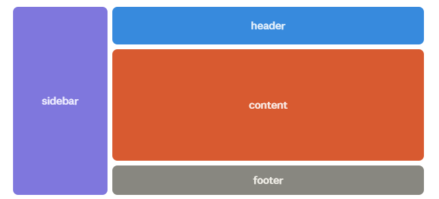
Tip: Grid template areas are one of the easiest ways to visually understand your layout just by reading the CSS — no need to mentally calculate row and column numbers.
Aligning Items Inside a Grid
Sometimes items don’t fill their entire cell, and you need to control their position within it.
| Property | Applied To | Controls |
|---|---|---|
justify-items | Grid container | Horizontal alignment of items inside their cells |
align-items | Grid container | Vertical alignment of items inside their cells |
justify-content | Grid container | Horizontal alignment of the entire grid within the container |
align-content | Grid container | Vertical alignment of the entire grid within the container |
justify-self | Individual grid item | Horizontal alignment of one specific item |
align-self | Individual grid item | Vertical alignment of one specific item |
css
.container {
  display: grid;
  grid-template-columns: repeat(3, 1fr);
  align-items: center;
  justify-items: center;
}
What’s happening here? align-items: center vertically centers every item inside its own cell, and justify-items: center horizontally centers them too — useful when your grid items are smaller than their cells and you don’t want them stuck to a corner.
Real-world use case: This is how icon grids (like an app’s settings menu) keep every icon perfectly centered inside its own box, regardless of the icon’s actual size.
Responsive Grids with auto-fit and minmax()
This is where CSS Grid becomes genuinely powerful for real-world responsive design — without writing a single media query.
css
.container {
  display: grid;
  grid-template-columns: repeat(auto-fit, minmax(200px, 1fr));
  gap: 20px;
}
What’s happening here?
minmax(200px, 1fr)tells each column to be at least 200px wide, but allowed to grow and share extra space equally (1fr) when there’s room.repeat(auto-fit, ...)tells the browser to automatically fit as many columns as possible based on the available width — adding or removing columns as the screen resizes.
Output: On a wide desktop screen, you might see 5 columns. Resize the browser down to tablet width, and it automatically drops to 3 columns. On mobile, it drops to 1 — all without writing a single @media rule.
Real-world example: This is precisely how Amazon and Flipkart’s product grids adjust seamlessly between desktop, tablet, and mobile — more products per row on a laptop, fewer on a phone, with zero manual breakpoints needed for the column count itself.
Note:
auto-fitandauto-fillbehave similarly but differ when there are empty columns left over.auto-fitcollapses empty tracks to zero width;auto-fillkeeps them, leaving visible gaps. For most product/card grids,auto-fitgives the cleaner result.
CSS Grid vs Flexbox
This is the question every beginner eventually asks: “Do I use Grid or Flexbox?”
If you’ve already gone through our CSS Flexbox guide, you already know Flexbox is great for aligning items in a single direction. Grid takes this further by handling rows and columns together.
| CSS Grid | Flexbox | |
|---|---|---|
| Dimension | Two-dimensional (rows AND columns) | One-dimensional (row OR column) |
| Best for | Overall page layout, card grids, dashboards | Navbars, toolbars, aligning items in a line |
| Item sizing control | Strong — precise row/column sizing | Flexible — content-driven sizing |
| Alignment | Powerful for 2D grid alignment | Powerful for 1D alignment |
| When to use | When you need structure in both directions | When you need items to flow and adjust in one direction |
Real-world example: A webpage’s overall layout — header, sidebar, main content, footer — is a great fit for Grid. But the navigation bar inside that header, where menu items need to line up neatly in a single row with equal spacing, is a great fit for Flexbox.
Tip: In real projects, you’ll often use both together — Grid for the overall page structure, Flexbox for smaller components inside it, like navbars, buttons, and cards.
Common Mistakes Beginners Make
- Forgetting
display: grid— none of the grid properties work until the container itself is set togrid. - Confusing grid item properties with grid container properties — for example,
grid-template-columnsgoes on the container, whilegrid-columngoes on the individual item. - Counting grid lines from 0 — grid lines start from 1, not 0, unlike array indexes.
- Using fixed pixel widths everywhere — this breaks responsiveness. Prefer
frunits andminmax()for flexible layouts. - Overcomplicating simple layouts with Grid — a single row of buttons doesn’t need Grid; Flexbox is simpler and sufficient there.
- Forgetting that only direct children become grid items — nested elements deeper inside a grid item are not automatically part of the grid.
Best Practices
- Use
grid-template-areasfor complex page layouts — it makes your CSS far more readable at a glance. - Prefer
frunits andminmax()over fixed pixel widths for anything that needs to be responsive. - Use
gapinstead of margins for spacing between grid items — it avoids uneven edge spacing. - Combine Grid (for overall layout) with Flexbox (for component-level alignment) rather than forcing one tool to do everything.
- Name your grid areas meaningfully (
header,sidebar,footer) so the layout is self-explanatory just from reading the CSS. - Test your grid at multiple screen widths early, rather than fixing responsiveness at the end.
Real-World Use Cases
- E-commerce product grids — Amazon, Flipkart, and Myntra all use grid-based layouts for product listings that adapt to screen size.
- Photo galleries — Instagram-style grids of equally sized, evenly spaced images.
- Admin dashboards — sidebar, header, and content areas structured using
grid-template-areas. - Blog layouts — main content area alongside a sidebar with related posts or categories.
- Pricing tables — comparing multiple plans side by side in evenly spaced columns.
Interview Questions on CSS Grid
- What is the difference between CSS Grid and Flexbox? Grid is a two-dimensional layout system (rows and columns together), while Flexbox is one-dimensional (a single row or column at a time).
- What does the
frunit mean in CSS Grid? It represents a fraction of the available space in the grid container, allowing proportional, flexible sizing instead of fixed widths. - How do you create a responsive grid without media queries? Using
grid-template-columns: repeat(auto-fit, minmax(min-size, 1fr)), which automatically adjusts the number of columns based on available space. - What is the difference between
justify-itemsandjustify-contentin Grid?justify-itemsaligns items within their individual cells, whilejustify-contentaligns the entire grid within its container. - What is
grid-template-areasused for? It lets you define a layout visually using named regions, then assign elements to those regions usinggrid-area— making complex layouts easier to read and maintain. - Do grid items need to be direct children of the grid container? Yes. Only direct children of an element with
display: gridautomatically become grid items.
FAQs
Q1. Is CSS Grid supported in all browsers? Yes, CSS Grid has excellent support across all modern browsers, including Chrome, Firefox, Safari, and Edge. It’s safe to use in production projects today.
Q2. Should I learn Flexbox or Grid first? Either order works, but many developers find Flexbox slightly easier to start with since it’s one-dimensional. Once comfortable, Grid builds naturally on those same alignment concepts.
Q3. Can I use CSS Grid and Flexbox together in the same project? Absolutely, and it’s very common. Grid handles the overall page structure, while Flexbox handles alignment within smaller components like navbars and cards.
Q4. What’s the difference between auto-fit and auto-fill? auto-fit collapses empty grid tracks so items stretch to fill available space. auto-fill keeps empty tracks in place, which can leave visible gaps even when there’s fewer items than columns.
Q5. Do I need to specify both rows and columns every time? No. If you only define grid-template-columns, Grid automatically creates rows as needed to fit your content, using a default row height unless you specify grid-auto-rows.
Summary
CSS Grid gives you precise, two-dimensional control over layout — something floats and margins were never really built for. You now understand:
- What CSS Grid is and why it exists
- Core terminology: container, item, track, line, and area
- How to define rows, columns, and gaps
- How to place items manually and build named layout areas
- How to align items within a grid
- How to build fully responsive grids without media queries
- When to reach for Grid versus Flexbox
Conclusion
CSS Grid feels a little abstract the first time you read about it — but the moment you build one real layout with it, like a product grid or a dashboard, it clicks fast.
Start small. Take a simple 3-column layout, add a gap, then try grid-template-areas on a basic header-sidebar-content-footer structure. That hands-on practice is what makes Grid feel natural.